Design House Impressions
I was finally able to make it last week to the Spring ’08 Design House at the Washington DC Design Center before it closed on Saturday. I was prepared for it not to be that inspirational but once there, I thought otherwise. Here are my impressions:
1) The Entry was bright and bold capturing the theme of Color. From a distance it looked fine but up close I was surprised at how much prominent “bleeding” was visible on each of the horizontal stripes. It’s almost impossible to not get bleeding when taping off and painting stripes but this requires going back and “touching up” — painting over all those bleeds — where the paint goes under the tape. I always do this because it makes it looks clean and professional. It also takes a tremendous amount of time.
2) I was happy to see that the circle, the theme I discovered in my last Design House visit, was still popular. It was used throughout the Foyer as seen in the chandelier, the ottoman, chair placement, mirror and accessories. Interior design by McMaster Wallace Interiors.
Some rooms were bland and expected but others were out of the box interior design, as were the following:
3) I loved the suede-like colorwashing in the Bedroom and with the damask stencil over top. The horizontal stripe at the height of the wall and the structural wall break below it seemed to lower the height of the ceiling and overall appearance of the room. The horizontal stripes in the adjoining room were painted with no bleed marks. Very nice and everything was executed to give a sophisticated calm feel. Interior design by Dennese Guadeloupe Rojas of Interiors by Design.
4) The Living Room had a pop art feel. Although it wasn’t my style I noticed the humor in the panda chair, which was a wire mesh butterfly chair covered in stuffed toy pandas that were sewn together. This was surprisingly comfortable. I also appreciated the irridescent, woven wallcovering and that it was also used as a focal wall with printed Andy Warholish, repeated Asian portraits. Even the water bottles were artistic with a flamboyant Christian Lacroix floral design. Interior design by David Herchik.
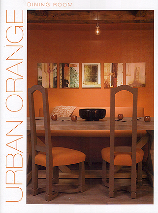
5) My favorite room was the Dining Room because it was the most unexpected. I liked the orange walls but even more so with the glitter, clear topcoat paint. This helped transform a dark space with reflective light. The room was a nice balance of urban Zen with rustic minimalism as seen in the barn-like, wide plank flooring, which was mimicked in the farmhouse dining table. The overall effect was very loungey and reminded me of restaurant Zengo. Interior design by Camille Beers.
I thought this was worth attending and it provided some fresh new takes on interior design, which I always find inspirational.


One Comment
John Aydan
Amazing,
Very inspiring post, thanks a tonne for sharing. Truly amazing pictures…